Showing posts with label contemplations. Show all posts

Wednesday, May 18, 2016

Does the Wind Affect MPG?

Cars today are so powerful that we rarely notice winds as we hurtle along at highway speeds, but believe it or not, your vehicle uses more fuel driving into the wind versus driving through calm air. Need proof? I believe the data below can prove it.

A Little Overview
Previously, I shared my evidence that air temperature affects fuel economy, and my evidence for wind speed comes from the same source. I've recorded the miles per gallon (MPG) I achieve on my commute to work each morning, and combined that data with wind speed measurements recorded by weather services reporting on the internet. Bear with me as I try to show the correlation I think is evident in the data.

The Simplified Analysis
This first chart compares the wind speed reported by a weather station in my area with the MPG recorded by my car. As you can see there's no real correlation between fuel economy and wind speed. What's missing is the direction of the wind relative to the car.

Intuitively, we expect a headwind to lower fuel economy while a tailwind should increase it. Without a directional component to the data, it appears to be random, and one might conclude that fuel economy is independent of wind speed.

Fortunately, the wind speed data sources used for this analysis include the direction of the wind. Given the wind speed and direction, the resultant direction of my commute based on the start and end points, and the average speed of the vehicle, we can calculate what I call the "Average Relative Headwind Speed." In simple terms it's the average speed of the air striking the car as it traveled over the entire commute, and combines the effect of the wind speed with the speed of the car.

This plot shows a stronger trend than the first plot, indicating that as relative headwind speeds decrease, fuel economy increases. You might also notice that it's difficult to represent the trend with one simple curve (shown here as a solid red curve). I believe that's because fuel economy is dependent on other factors besides wind speed, or temperature for that matter. In a future post, I'll try to combine all these factors in a way that better represents the connection between multiple weather conditions and fuel economy.

More Details on Assumptions, Methods, and Data
As I mentioned earlier, this data was gathered while commuting to work each morning in my 2013 Volkswagen Passat TDI SE which has a diesel engine and manual transmission. The MPG readings were provided by a dashboard monitor that computes average MPG over the course of a trip. I don't know how VW programs that calculation, but presumably it's a function of distance traveled and fuel flow to the engine.

The data presented here was gathered between February 9 and July 2, 2015 so that the date range matches my previous post, Does Outside Air Temperature Affect MPG? In that post, I noted that the route was consistent each morning until April 2, when road construction added a detour that included a longer 45 mph zone each day until the end of the data period. I've continued gathering data since then, so more data is available and will likely be shared in the future. As traffic and road conditions allowed, I attempted to maintain the same speed on each section of road each day, and tried to make my accelerations and braking consistent between commutes. Because I commute before 6 AM, traffic rarely interfered with my ability to maintain a consistent pace.

The direction of my route is simply based on a straight line drawn between the start and end points of my commute. The angle of that line relative to true north was calculated, and compared to the average wind direction during the commute to determine the angle of incidence with which the wind struck the car. Wind speed and direction were gathered from weather stations reported on wunderground.com, and chosen for their proximity to my route and ability to reflect the conditions my car experiences.  Unfortunately, winds can change speed and direction over the course of a 40-minute drive, so without more sophisticated ways of recording and calculating based on those changes, my results will suffer some amount of error due to this variation in the wind. I'm sure that shows up as some of the scatter in the data, but I don't currently know how to estimate that effect.

The Average Relative Headwind Speed (ARHS) was calculated by representing the car's average speed and direction as one vector, and the wind's speed and direction as another vector. The vector resulting from adding the two is the ARHS. When both vectors are pointing the same direction, the magnitude of the resulting vector is simply the sum of the two. When my car is driving directly into the wind, the magnitude of the ARHS is the difference of the two. Any angular difference in the direction of my car and the wind requires some trigonometry to achieve the ARHS.

The polynomial trendline shown on the second chart above was calculated by Microsoft Excel, and I chose a second-order polynomial because I know the force of the wind on an object is directly related to the square of the speed of the wind. I think fuel economy is probably linearly related to that force, so approximating the relationship between fuel economy and relative wind speed as a second-order polynomial made sense to me. I've wondered about the effect of the outliers on this approximation, but I'll leave that analysis for another day.

Conclusion
The effect of wind speed on fuel economy is evident in the data. The scatter in the data is greater than I'd desire, but likely exists because (a) my analysis ignored a variable(s) that also has a strong effect on fuel economy, and/or (b) my assumptions and measurement methods are too general. I am pleasantly surprised that the data shows the basic shape of a second-order polynomial, even if the coefficient of determination is rather low.

The next time we visit the MPG topic, we'll look at the effect of water on the road, and possibly some conclusions based on multiple variables.

Related post:
Does Outside Air Temperature Affect MPG?

Friday, July 17, 2015

Top 5 Blog Posts by Page Views

It's been awhile since we've reported which of the posts on this blog are most popular, and since a trend has established itself over the last four years, it's time for an update. Listed below are the five posts that have been viewed most as recorded by the statistics feature built into Blogger. Although I often have reasons to doubt the data, it's the best record I have to date. In order of popularity, I present the top five blog posts.


When we first reported the most popular posts in May of 2011, this post was only a few months old but still managed to rank #7 against many posts that had been around much longer. This post has been consistently popular since its publication and continues to rank near the top regardless of the time scale: views in the last month, week, or day. Comments left on the post indicate there are other do-it-yourselfers that have referred to my story, which is gratifying, but makes me wonder how they found my page?

Since Google refers more viewers to this blog than any other source, I've assumed most of the visits to this post came from Google searches on radon systems. I think that may be a faulty assumption. My search for "radon mitigation system installation" revealed that my blog post didn't show up in the first 62 pages of results, at which point Google refused to show me any more of the alleged 102,000 results for my search. Evidently some other sources are directing folks here, and at a pretty consistent rate since 2011.

2. Gutter Hanger Testing

This post is a perennial favorite as well, indicating to me that the need for clear answers on gutter hangers has not abated since 2009. This post was at the top of the list when we first reported ratings in 2011, but by the spring of 2013 it had surrendered the top spot to the radon system installation post. While now running far behind the #1 post, this post still has a comfortable lead over the third place post.

3. Freeport McMoRan Morenci Copper Mine

I suspect this post gets most of its views from folks looking for information on the company that runs the mine, but I still hold out some hope that there are a few people out there that appreciate my personal perspective of my tour of the mine in 2010. This post actually passed the gutter hanger post in popularity in early 2012, but conceded the first place position by fall of that year, and was passed by the radon installation post a few months after that.

4. Corn Growth Chart

I think it's appropriate that at least one of my corn posts is popular enough to be in the top five, since it seems every time I meet someone that has visited this blog they mentioned my corn growth posts. This post shows up on the second page of Google search results for "corn growth chart," and even appears near the top of the image search for the same term. If you put the phrase in quotes, it's Google's top result! I suspect that may have driven a lot of the visits over the last six years, but a scarcity of views recently may allow other posts to accumulate views more quickly and knock this one out of the top five.

5. Williamsburg in the Fall: Buildings

Of all our posts on Colonial Williamsburg (36 so far), this one from 2009 has most consistently held a spot in the top 10, although three other CW posts have visited the top ten as well. A Google search for "Williamsburg buildings" (quotes included) finds this post on the seventh page of results, but changing the search terms to "Colonial Williamsburg buildings" moves it up to the third page. Although this post is not far behind the #4 post, its views per day rate is almost identical, which means I don't expect it to move into the #4 slot very soon.

It's probably not surprising that all five of these posts are at least four years old. An older post has more opportunity to attract views, and has an advantage over newer posts on total views count. For that reason I decided to calculate views per day rates for the top ten posts, and others that were close to the top ten, but posted recently enough that their popularity over time has not yet been fully realized. Interestingly enough, the #8 and #6 posts for total page views rank in the top five for views per day.

Honorable Mention:  An Experiment in Greenwich

This post ranks #4 in views per day, but since it's less than three years old, it still only ranks #8 for total views. While writing this post, I finally realized why tripadvisor.es (Spanish version of TripAdvisor) referred so many visitors to my blog. On this page: http://www.tripadvisor.es/ShowTopic-g186338-i17-k6300068-Como_llegar_a_Greenwich_para_visitar_el_meridiano-London_England.html the fourth responder included a link to my post on Greenwich, and by doing so, helped boost the ratings of the post. I'm glad at least one person linked to this post, since it's one of my favorites.

Honorable Mention:  Basement Bathroom Project

Although this post gets the fifth most views per day of all my posts, I'm at a loss to explain why. Having lived through the project, the post brings back lots of fond memories, but the pictures only show the ugly stages of the project before the pretty, finished pictures were taken. Nonetheless, it's views per day rate continues to be strong enough that it should move into the top five for total views if its pace continues.

I'll try to remember to report these ratings again before another four years passes, especially if we have a change in the top five posts. In the meantime, you can elevate your favorite post in the standings by visiting it several times each day. Imagine the satisfaction you'll feel! I'll keep trying to post something at least moderately clever, and you keep refreshing your browser, and together we'll shake up the ratings!

Saturday, July 4, 2015

Does Outside Air Temperature Affect MPG?

Most of us that have driven vehicles in cold weather have recognized that they consume more fuel as the outdoor temperature drops. We might attribute it to letting our cars sit and idle in order to maintain a warm interior, or we might surmise that slippery road conditions reduce fuel efficiency. While both of those factors decrease fuel efficiency, I've gathered some data that indicates the temperature of the ambient air also affects the efficiency of internal combustion engines.

I began collecting data on February 9 this year using my 2013 Volkswagen Passat TDI SE with a diesel engine and manual transmission. My car has a meter that calculates average fuel economy (miles per gallon) for each trip, so I've been recording the fuel economy for my trip to work each morning. My route is identical each day and while my data doesn't represent an entire year, the temperature range is wide enough that I don't expect significant changes in the data over the next seven months. Road construction on my route added a detour beginning April 2, which increased the distance and added more 45 mph zone driving to the trip. I've noted the route change in my data, but what's presented here includes data from both routes.

My Volkswagen owner's manual includes this chart that predicts an increase in miles per gallon as trip length increases and also as temperature increases.  Volkswagen's chart implies that my fuel economy would increase further if my commute were longer than my current 30.8-mile trek. I attribute that effect to the inefficiency of an internal combustion engine at temperatures lower than the normal operating temperature, and to a lesser extent the higher losses in the powertrain due to cold lubricant. I have observed that it takes about 7 minutes for the temperature gauge to settle at the normal operating temperature in the winter, while it only takes about 5 minutes in the summer. Since my data covers nearly the same route every day, my chart doesn't duplicate Volkswagen's, but includes more temperature data than VW's two series.

My data indicates a pretty strong correlation between increasing ambient temperature and increasing fuel economy. The regression curve added to the chart reveals that the correlation is almost linear, but a slightly better fit to a second-degree polynomial with a stronger effect at colder temperatures. Although the coefficient of determination (R²) is relatively high at 0.8172, the scatter in the data convinces me that there are other variables affecting fuel economy besides temperature. Wind, traffic congestion, and speed are all obvious effects that probably contribute to the data scatter above. Some of these are out of the driver's control (wind or road conditions), while driving behavior clearly affects mpg and is clearly in the driver's control.

For my data, I've tried to accelerate consistently from one day to the next, I set the cruise control to the same speeds as much as possible, and fortunately traffic density does not often affect my speed at the time of day I make my commute. To reduce the variables related to air temperature, I drive no differently when the engine is cold in the winter than I do in the summer, i.e. my car doesn't sit stationary while "warming up" in the winter.

I chose one temperature each day based on the temperature recorded by the National Weather Service even though the thermometer in my car leads me to believe the temperature may vary by a few degrees over my route. More complex data gathering and analysis is possible, but is not included in the data I've presented. Since temperature alone does not represent the only effect on fuel economy, I've also collected data on other variables that should prove insightful in understanding fuel economy trends. Those data will be presented in future posts right here. In the meantime, it has been comforting each day to recognize a factor out of my control that can be used to predict fuel consumption for that trip.

Friday, June 26, 2015

The Four Best Things About Homeschooling

I wrote this article last fall for the newsletter of our local homeschool association, and I share it again here for your edification.

I’m Kurt Riggenbach, and I’ve supported my wife, Karen, as she did most of the work in educating our daughters over the past 13 years. Lily finished high school five years ago, and Gretel just finished this spring. They say you can know someone by the things they value, and because homeschooling has changed us so dramatically, I’d like to introduce our family through what I consider to be the four best things about homeschooling.

We set our own schedule. Not only did we decide when to study each day, but we chose which days are “school” days, and when we would take breaks during the year. Our girls both attended the public school for a time (five years for our oldest, and one for our youngest), so we were all familiar with the hassle and anxiety of arriving at the school building in the morning before the bell rang. In contrast, setting our schedule based on the natural morning rhythm of our family was a true blessing that probably added 10 years to my wife’s emotional life. It was a rare day that our school requirements weren’t satisfied by the time the public school let out in the afternoon, even though we usually started later than they did. That wasn’t too surprising, however, since my wife was exposed to the inefficiency of the government system when she served as a room mother in our daughter’s class, and became convinced that even the most incompetent home school could be more efficient than the public school.

We typically scheduled school for Monday through Friday, but we didn’t hesitate for a moment to take vacations when the public school was in session. In fact, we prefer vacationing in the spring and fall now as the weather is more moderate, crowds are smaller at most of the places we visit, and “off peak” discounts sometimes apply. We even occasionally used summer months to catch up on schoolwork or get ahead in a subject area.

Our daughters both took thirteen years to complete their K-12 education, primarily because we didn’t have any goals that required they finish earlier. Now that the State of Illinois is satisfied with their education, they continue to study subjects that interest them, and aren’t afraid of learning in unconventional ways, and on their own schedule.

We choose our own curriculum. I remember well the paper our young daughter brought home from the public school on which she was asked to list a person she wished to meet. Her answer: Monica Lewinsky. I was too embarrassed for her to inquire how she knew that name, or in what context it was presented that would cause a grade-schooler to desire to meet her. I was troubled that at the time she knew few of the names of the current elected leaders of our state or country, but she knew the name of an infamous White House intern. That was probably one of the straws that were quietly piling on the camel’s back of our decision to teach our children at home, and represents the control one relinquishes when their child is part of the public school system. Even though evaluating and choosing books and resources for each child can be daunting, the peace that comes with knowing what they’re learning and what they are not exposed to is immeasurable.

Granted, the State of Illinois requires that we teach certain subjects, but it wasn’t until we began homeschooling that we realized how much latitude one has in satisfying the requirements of the law. The APACHE conference opened our eyes to resources that presented a perspective different from that presented by the public schools my wife and I attended. Books and speakers challenged our paradigms in history, math, science, government, and writing to the extent that I sometimes felt like I couldn’t trust anything I learned in my first 18 years of life! We gladly chose resources that were based on a biblical worldview, and as a result, my children are stronger creationists and better-balanced historians than I am, and that makes me happy.

We’re part of a great culture. Fourteen years ago I would not have guessed that some of our closest friends would be the homeschoolers we met while touring Colonial Williamsburg. We were in the early months of our homeschooling adventure when we realized our friendships with other homeschooling families were the closest friendships we had. Many of those friendships still thrive today, and we continue to add new friends as we travel to attend new conferences, events, or simply sightseeing. More often than not, we recognized common philosophies and values after only a few moments of conversation.

Homeschooling Christians often have so much in common that it’s not difficult to feel like we’ve known each other our entire life when, in reality, we’ve only just met. Shared goals and struggles help bind our homeschool culture together, and they often prove stronger than ethnic, geographic, economic, and even doctrinal differences. Our strongest bond, however, could be that we not only see our method of educating as consistent with scripture, but many of us feel compelled to teach our children at home. It’s not a trivial thing to reject the public school culture of our day, and our common resolution in that effort joins us closer together.

Maybe that’s why it’s not uncommon to find homeschoolers worshipping together in congregations in which they outnumber those that choose other education options. We eventually joined a church composed primarily of homeschoolers several years ago, and we find it a natural fit with many of the convictions God has forced us to face in the last 13 years. In fact, God continues to use His Spirit through many imperfect people in our culture to convict us in areas where we fall short of his will, and we appreciate that aspect of our homeschool culture.

We spend time together. When our oldest daughter was nine years old, the public school consumed all but 2 or 3 of her waking hours each week day. Recognizing then that she might leave our home in as few as nine years, we were startled by the realization that we may never know her very well if we continued at that rate. God opened our eyes then and allowed us to deepen our relationships with our children through something as simple as spending more time with them. My wife benefitted more than I since she did almost all the instruction while I spent a good part of my day working away from home, but our family slowly began acting more like a family and less like individuals living together.

We still have individual interests, individual friends, and times when we do activities individually, but our identity as a family is now as strong as our identity as individuals. Time will tell if we put too much emphasis on being together instead of building independence, but at the moment, we’re all enjoying our time together.

Few decisions in my life have changed as many aspects of my life as our decision to bring our children home for their education. That decision clearly seemed to be a test of our obedience to what we felt the Lord was commanding us to do, and required a good bit of faith at the time. Even so, it was a relief to obey as the conviction was so strong we knew we would be miserable if we didn’t. God has continued to challenge our beliefs or practices in many areas, frequently using people that we would not have met were we not part of the homeschooling culture. We pray God continues to challenge us for the rest of our lives.

Tuesday, May 26, 2015

Heating Season Temperature Data and a Couple More Charts

A few weeks ago, we shared the data that indicated our winter temperatures were about as close to average as possible this year.  As we look at the entire heating season, the data looks a bit different.  If these charts look unfamiliar, see the footnote at the bottom of this post for an explanation of the data presented in the charts.

The entire season can be summarized by the position of the red curve at the right side of the chart, where it's apparent that over the entire season our daily average temperatures were considerably warmer than normal.  We accumulated 361 degrees of daily deviation above the average, which means each of the 244 days of our heating season (yep, that's about 8 months!), averaged about 1.5 degrees warmer than normal.

An interesting phenomenon to note is that in early March our heating season was close to the historical norm.  Predominately warmer than normal temperatures since early March have produced our entire cumulative deviation from normal, indicating that the 78 final days of the season averaged over 4.6 degrees warmer than the historical norm.

Recently it occurred to me that all our readers may not have gleaned all the information these temperature charts can communicate, so I present the next chart as an educational tool.

I include the red cumulative deviation curve on these temperature charts for two main reasons: (1) the ability to determine how the data as a cumulative total compares to historical norms, and (2) to recognize trends in the temperature data that may not be easily apparent in the blue daily deviation bars.  On this chart I've added red (warmer) and blue (colder) arrows to illustrate the trends indicated by the red curve (feel free to click the chart for an enlarged view).  In case you hadn't noticed, when the red curve slopes up from left to right, that indicates that the daily deviations from normal have been predominately warmer than average.  Likewise, when the curve slopes down from left to right, colder deviations have predominated.  One can easily recognize at least seven extended temperature trends through the last heating season: four when warmer temperatures prevailed, and three when the daily averages below normal outweighed those above normal.

Since temperatures that were near normal would present a red curve that was roughly flat from left to right, I found it interesting that we seldom observe that characteristic in our temperature data.  Instead, it seems our temperatures are either well above normal or well below normal, leaving very few "normal" days!  This lead me to conjecture that a histogram of the daily temperature deviations for an entire year might look different than the normal distribution, or "bell curve" that one might expect.

To my surprise, the histogram showed our weather to be a lot more "normal" than I expected.  A histogram is a chart in which each bar represents the number of times (or frequency) that a certain temperature deviation was attained.  In the chart above, each bar actually represents a range of temperatures three degrees wide.  For instance, the short bar at the far right indicates that there was one day in which the deviation from average was greater than 21 degrees, but less than or equal to 24 degrees.  The next bar to the left shows five days in which the deviation from average was greater than 18 degrees, but less than or equal to 21 degrees, and so on.  As expected, there aren't many instances at the extreme temperature deviations represented, but there are quite a few days in which the average temperature was very close to the historical average.

The most populated group is that in which the average temperature was the same as the historical average or one or two degrees colder.  The number of days in 2014 when the mean temperature was within 5 degrees colder to 6 degrees warmer than the historical average was 182, just shy of half of the days of the year.  Since 2014 ended a little colder than normal, it might be surprising that 168 days were colder than the historical average, while 179 were warmer, and 18 days matched the historical mean.

Footnote: The blue bars in the upper two charts represent the daily temperature deviation from the historical average for Central Illinois as measured at the Greater Peoria Regional Airport.  Since each day has a historical average high and low temperature, the average of the high and low represents the historical daily average or mean.  The average of the actual high and low temperature represents the actual mean, and the difference between the historical mean and the actual mean represents the daily temperature deviation.  On these charts, all temperatures are shown in degrees Fahrenheit.

Saturday, April 18, 2015

Central Illinois Winter Temperature Summary, 2014-2015

Now that winter is officially finished, we can look back at the temperature data and compare reality to what we remembered. I think everyone here in Central Illinois perceived our latest winter to be warmer than the one before it, but prolonged cold (and warm) spells have a way of making comparisons difficult from year to year. The data is presented again this year in the form of combined bar and line charts. The blue bars represent the deviation of the daily mean temperature from the historical average where each bar represents one day. The red curve represents the cumulative deviation from the historical average, and indicates whether the season as a whole was colder or warmer than what we'd typically expect.

The first observation I'd like to bring to your attention is the value of the red curve at the right side of the chart. Including data from March 20, the cumulative deviation from average was -3 degrees. That's almost as close to "normal" as one can get. That means, on average, the daily mean temperature was about 0.03°F colder than the historical average each day. That's a temperature difference most of us can't perceive. It's also probably a smaller number than the error in the measuring equipment at the National Weather Service in Peoria, not to mention the fact that the daily mean temperatures I use are reported as integers that have already been rounded a fraction of a degree each day.

It's also interesting to note that the winter as a whole was warmer than normal until the last week of February, indicated by the red curve crossing the x-axis into negative territory on February 26. February 27 added momentum to that move by recording the largest deviation from average of 28 degrees F below the historical mean. The deviation of 23 degrees F above normal on March 23 recorded the largest deviation on the warm side.

By comparison, we can look again at the data from the winter of 2013-2014 and notice that the cumulative temperature that winter was above normal only a few days all season. I think most of us are happy not to repeat those temperatures this year.

To illustrate just how unusual our temperatures were last winter, I've plotted the cumulative deviation curves for both winters on the same scale on this chart. In both cases, February contributed the largest cumulative degrees below normal, but this year a significant warming trend began on March 7 that carried through the end of the season. Another significant difference this winter was the 18 consecutive days of warmer than normal temperatures beginning on January 15. Those days averaged 10.5 degrees above normal and contributed greatly to counteracting the colder than normal periods.

Since our historical mean temperatures are still low enough to expect heating degree days this time of year, we are technically still in our heating season. We'll continue to compile data to see whether this heating season as a whole was warmer or colder than average.

Sunday, May 25, 2014

Winter Weather Summary, 2013-2014

Back on February 13, I showed temperature data for the heating season and winter that showed a colder-than-average trend through that date.  Now that the heating season is most likely behind us, we can look at the data for the full season.  The first chart shows the full winter from December 21 through March 20 and even though the last couple of weeks averaged less than one degree F colder than normal per day, the consistently colder stretch from February 22 through March 6 pushed the cumulative deviation to a total of 532 degrees colder than average.

That means each day of winter averaged 5.9 degrees colder than normal.  February takes the prize for the coldest month with an average daily mean 10 degrees colder than normal.  Anyone suspecting that this winter was colder than normal can rest assured that their suspicions are confirmed by the data.

If we look at the entire heating season, we see a similar trend in that even though the average temperatures warmed a bit in April, the average over the entire season was still over 4 degrees colder than normal.  The cumulative deviation from normal ended the month of April 533 degrees colder than average which means the days between the end of spring and the end of April averaged out to be about equivalent to the historical average.

The effects of winter are still apparent in several places: yew branches that were frozen beyond recovery, rose bushes that didn't survive, and although the almond bush bloomed a couple weeks ago, many of those branches now appear to be dead.  We're happy to concentrate on growing-degree days now, and are hopeful for some harvest from those plants that survived the winter of 2013-2014.

Thursday, February 13, 2014

Has this been a normal winter?

Most of us here in Central Illinois have noticed that the temperatures have been running a bit colder than average over the last few weeks, such that some of us have wondered, "Is this winter colder than normal, or are we just spoiled by the last two winters that were milder than average?"  For the sake of this investigation, "normal" temperatures are the simple average of the historical average high and low temperatures for each day.  For instance, the historical average high for February 13 is 36°F and the low is 19°F in Peoria, Illinois, so the "normal" mean temperature for today is 27°F.  Naturally, it's unusual to experience both the average high and low on any given day, so comparing the mean is helpful in determining whether the weather has been warmer or colder than average.

Figure 1 below shows the daily temperature deviation from average since the beginning of winter on December 21.  The blue bars represent the degrees F above or below the daily average, while the red curve is the cumulative deviation from the average over the same period.  Of the 54 days recorded so far, only 17 have been warmer than the historic average, and of the 35 colder days, 25 are 10 or more degrees colder than their average.  January 6 deserves special recognition for recording a mean temperature 31 degrees colder than the historical average!  The mean that day was -9°F, and the high for the day reached -5°F, but alas, that was not the coldest January 6 on record.

Figure 1: December 21 through February 12

The cumulative deviation from average briefly wandered into positive territory twice in December, but has been solidly colder than the average ever since.  Currently, our winter is a cumulative 339 degrees colder than average, which means the daily mean temperature has averaged over 6 degrees colder than average. Since the beginning of 2014, we've averaged over 7 degrees colder than average, and the month of February is averaging over 16 degrees colder than average per day even though February 1 was warmer than the historical average!

Figure 2: September 21 through February 12

In some respects, the entire heating season since last September looks warmer than just the winter data, primarily due to the warm weather from the end of September to the middle of October.  The cumulative deviation is even greater over this period than over the winter period, however, which means our fall season was actually colder than average despite the warm start.  Our 362 degree cumulative deviation works out to about two and a half degrees colder than average per day for the 145 days of fall and winter so far.

So, back to the question in the title, has this been a normal winter?  Yes, it has been normal in the sense that we've had some days warmer than average, and some days colder than average.  But no, it has not been normal in the sense that the temperatures have averaged much colder than the historical average so far. Winter isn't finished, however, as we have 36 more days until spring and a warming trend in the forecast. In order to finish the winter even with the historical average, each of the remaining 36 days would have to average over 9 degrees warmer than average. Plenty of people around here would welcome a trend like that!

(Editor's note: a variation of the word "average" appears 38 times in this post)

Thursday, September 27, 2012

An Experiment in Greenwich

I'm one of those people who enjoys watching the odometer on the car change from lots of nines to lots of zeroes, so when we decided to visit the Royal Observatory in Greenwich I knew I had an opportunity to do a little experiment.  In case you didn't realize, the Prime Meridian at Greenwich was established by Sir George Airy in 1851 and recognized by most of the world in 1884 as the zero longitude line for the earth, separating the Eastern Hemisphere from the Western Hemisphere.  As you can see in the photo below, the line is clearly marked on the ground and on one of the buildings of the observatory, so one can easily situate himself atop this important landmark.

I did just that with my trusty Garmin Nuvi GPS device confident I'd see so many zeroes it would make me giggle.  The photo below shows the device laying on the ground directly on top of the Prime Meridian.

The device did not display as many zeroes as I expected, so I naturally asked myself, "Why?"

I knew that all GPS devices have some error, and that automotive devices like mine are not as accurate as devices that might need resolution in inches.  I guessed the non-zero portion of my reading represented that error.  Since I'm a curious sort, I next set about trying to calculate how much distance is equivalent to the 0.00152 degree "error" displayed by the GPS.  Since the earth is not perfectly round, this calculation is not as trivial as it seems.  Fortunately there are many published estimates of the equatorial radius and the polar radius of the earth, so estimating distances at Greenwich should be possible.

My first attempt assumed the radius of the earth at Greenwich was equal to the average of the polar and equatorial radii.  That's a pretty rough assumption, but I was still surprised when I calculated that 0.00152 degrees was equivalent to about 105.21 meters on the ground.  That's a significant error that's big enough to put someone on the wrong street if it occurred while navigating.  I decided to try a different calculation.

My second attempt assumed the earth has an ellipsoid shape with the equatorial radius representing the semi-major axis, while the polar radius represented the semi-minor axis.  The radius of the circle of latitude passing through Greenwich is a little smaller by this method, but the distance equivalent to 0.00152 degrees is only a few centimeters smaller at 105.17 meters.  Given the agreement between these two calculations, it appears that my GPS thinks I'm 105 meters west of the prime meridian when I'm standing on the Royal Observatory's Prime Meridian.

What happens when I plug that latitude and longitude into an online map?  Bing seems to have the highest resolution image of the Royal Observatory, so this is what you'll see if you enter 51.47792, -0.00152 in the search bar for Bing Maps.  (Brief tangent: Bing's image of Greenwich seems to have been taken early this summer as you can see the Olympic beach volleyball venue partially constructed in the park between the Royal Observatory and the Queen's House.)

You'll have to trust me that the dot on the image above is only a meter or two away from where I was standing when I took the photo of my Garmin.  You can try the numbers in Google Maps or Mapquest, but the results should be similar to what you see above.  Why do the online map services agree with my Garmin, but none of them seem to realize that the line on the ground at the Royal Observatory is the true 0.00000 longitude mark?

After reading a bit on the subject of global positioning systems and international terrestrial reference frames, I learned that even though Airy placed the line on the ground in 1851 where the current meridian is marked, by  the late 1950s the Applied Physics Laboratory at Johns Hopkins University had developed the first satellite navigation system (TRANSIT) that would ultimately move the prime meridian upon which our modern navigation systems are based.  Although TRANSIT was intended to agree with Airy's prime meridian, some assumptions in the definition of its location caused other landmarks around the world to be shifted relative to their location based on Airy's work.  Eventually the International Reference Meridian (which was based on locations relative to TRANSIT) defined by the International Earth Rotation and Reference Systems Service came to be accepted as the prime meridian upon which our navigation systems are based, including my Garmin GPS.  Where is the International Reference Meridian relative to Airy's Prime Meridian at Greenwich?  About 102.5 meters east.

That seems to indicate that my GPS unit has an error of about 2 to 3 meters based on my earlier calculations. That much error seems more reasonable.  I suppose one could walk 102 meters east of the meridian at the Royal Observatory until the display of a GPS unit read 0.00000, but for some reason that doesn't sound quite as charming.  I probably wouldn't even giggle.


Tuesday, August 28, 2012

Now I REALLY feel old

Even though I don't remember much about the first few years of my life, I have no trouble identifying with the decade of my birth.  The preceding decades, however, have always seemed like ancient history.  As a young man, I remember being startled by the realization that more years had passed since my birth than had passed between the end of World War II and the day I was born.  In my mind, WWII happened a long time before I was born.  In reality, it wasn't very long.

My great grandparents, Samuel and Sophie Riggenbach
The other day I performed a little more mental math and startled myself once again.  I don't consider myself an old man (yet), but I'm older now than all of my aunts and uncles were when I was born.  Since my dad is the youngest of ten siblings, I had a lot of older aunts and uncles.  I'm now more further removed from my birth than my birth is removed from the FIRST World War!  I think it's impossible to marry that thought with any illusion of being young.

Wednesday, July 25, 2012

Back x-ray update

It's been eight weeks since I fell off my bike so my chiropractor suggested we take a couple new x-rays to see how my bones are healing.  He thinks the bones are showing good progress, but are not yet completely healed.  Since he gave me a 12 week estimate initially, I'm not disappointed.

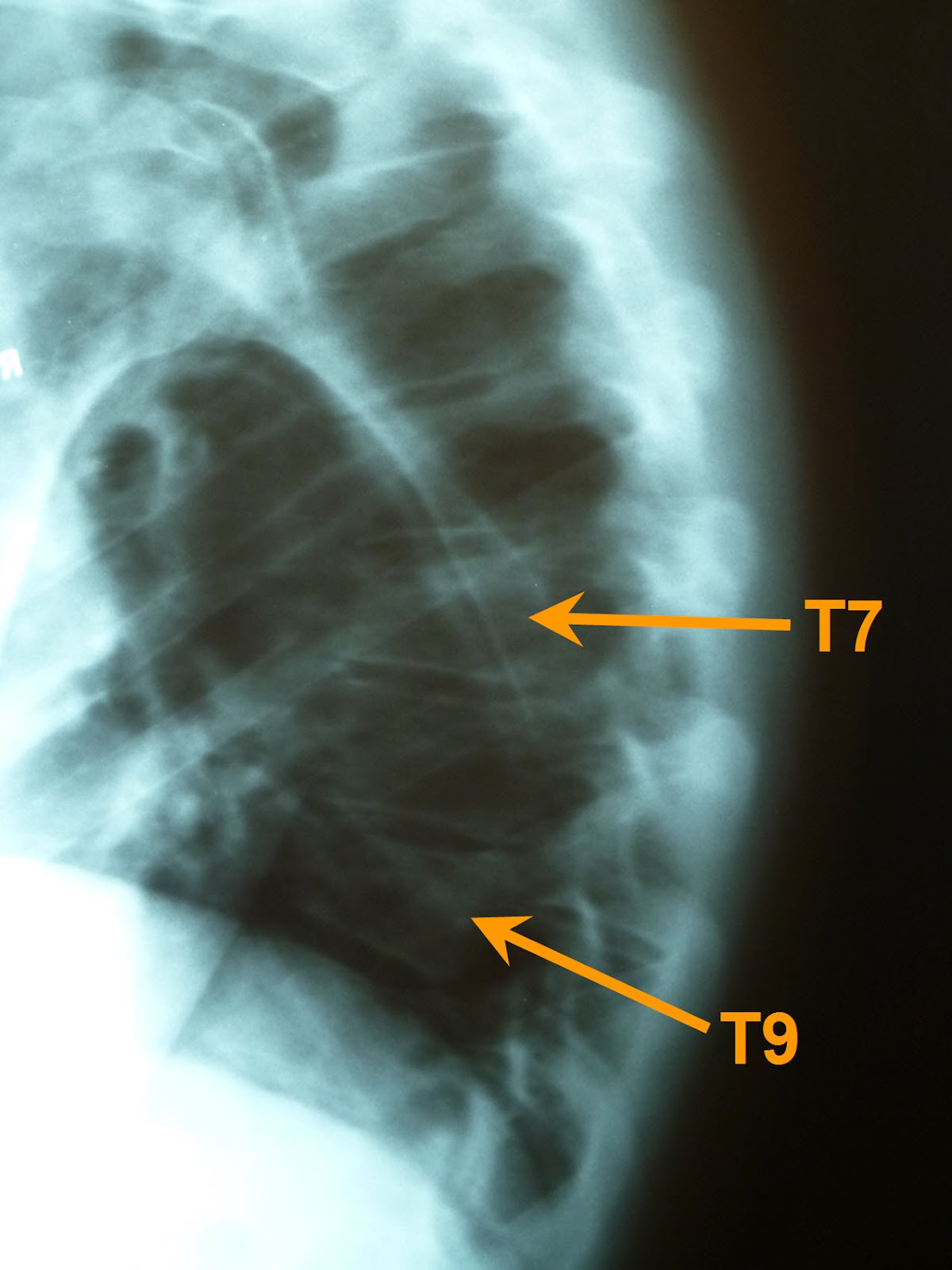
Interestingly, he noticed something else that had escaped his attention eight weeks ago.  It appears that I broke two vertebrae instead of just the one we previously noticed!  As you can tell in the image below, T7 has a wedge shape similar to T9, which is indicative of a compression fracture.

After (May 2012)
Fortunately, two broken bones are treated the same way as one, and my prognosis has not changed.  I'm grateful for noticeable progress in flexibility, strength, and comfort, although I suppose I'd agree that my back doesn't feel completely healed yet.

Before (2009)
For reference, I've included this image of that same portion of my spine three years ago.  If I hadn't seen my name on the x-ray film, I'd have a hard time believing my back looked this good!  Thanks to all who have been praying for my healing through this episode.

Saturday, June 2, 2012

More than you wanted to know about a bicycle crash

Since it's still pretty fresh in my memory, allow me to tell you a bit about the results of my carelessness on my bicycle.  I was enjoying a delightful bit of exercise last Monday evening, riding pleasant roads with enough elevation change to be interesting and yet not overwhelming.  A little over half way through my ride, I started down the hill near the west end of Tullamore Road, and looked forward to the rest it would provide for at least the next half mile until the effect of its slope would disappear.

Although I knew there was a fairly sharp corner about halfway down the hill, I neglected to brake until much too late.  By the time I reached the beginning of the turn it was apparent that I would not be able to brake hard enough to stay on the road.  My odometer indicated I reached 36 mph, which was probably just before I began braking.  My path took me to the far side of the right turn where I rode along the guard rail on the left side of the road for a short distance before I was catapulted.  The view of the guard rail below is similar to the last view I had before I closed my eyes.

When I stopped moving and opened my eyes, I was about forty feet further down the road, about fifteen feet down a grassy slope on the other side of the guard rail.  I couldn't see my bike, my helmet was falling off my head, and my back felt stiff just below my shoulder blades.  I climbed up the grassy slope to the road and sat on the guard rail while I tried to stretch my back and push the broken pieces of my helmet together so it would fit on my head.  Since my bike wasn't on the road, I concluded it must be near where I landed in the ditch, so I climbed back down the slope and found it about ten feet further downslope from where I landed.  After I carried it back up to the road, I was surprised to find everything intact on the bike (except the chain which had simply jumped off the chainring) and no damage evident anywhere.  Equally amazing to me was my observation that my only apparent missing skin was on a few fingers of my right hand.  My legs and arms had no cuts or abrasions at all!  After thanking God for preserving my transportation home, I climbed aboard and started down the rest of the hill toward home.

After riding about a half mile, something unfamiliar about my vision made me realize I had lost my glasses in the fall.  As long as there was a small chance I might find them, I had to go back and look.  I knew the probability that I would find the glasses was very low, so I entreated the Lord to bless my efforts and bring me to them.  I searched about half of the area where I had come to rest for about five minutes before the glasses were visible to me again.  God was thanked again.  Now that I had all my possessions, I climbed back on the bike and started the ride home again.

I didn't know the source of the stiffness in my back while I was riding, but it was apparent that I could not comfortably expand my rib cage as far as normal, so my breathing was not as deep as I desired.  X-rays taken by my chiropractor the next day allowed him to diagnose a compression fracture of my T9 vertebra, which is identified by the yellow arrow in the image above.  You can see that vertebra is not as square as the others around it, and is tapered toward the front.  Fortunately, the damage to the bone is concentrated toward the front of my body and not toward the back, and I have no symptoms indicating any damage to my spinal cord.  Several sources indicate spinal cord damage at this location can lead to paralysis below the waist.  Again, I'm grateful for God's mercy in limiting my injury.

It wasn't until I looked in a mirror when I got home that I realized my head was bruised and scraped in this colorful manner.  This picture was taken less than two days after impact, so the color is more severe in some places while less severe in others, but I think you get the idea.  My left shoulder showed similar bruising, and my left ear was pretty beat up, so it was apparent I probably first made impact with earth on those parts of my body.

Since my leg and bicycle showed no indication of contact with the guard rail, I believe the front wheel of my bicycle was probably stopped by some object on the ground while my momentum carried my body over the guard rail in a half flip, ultimately landing on my head.  Since my shoes were clipped to my pedals, I think my flying body must have pulled the bicycle over the guard rail behind me, and as I hit the ground and rolled, the bike must have detached from my shoes and flown over my body down the slope of the ditch.  I don't think my left foot released from the bike pedal easily, as my shoe and its cleat are both damaged in a manner that would suggest a lot of force was required to separate them.  I wish I could have witnessed all the gyrations my body and bike went through, as I think it would have been very interesting to watch.  Again, I'm grateful that God mercifully spared me contact with the guard rail, as I believe my injuries would have been more severe had I hit it.

This view of the inside of my helmet shows the cracks in the front (right side of the image) that resulted when the full weight of my hurtling body forced the helmet into the earth.  I had no dirt or grass stains on the front of my body after the fall, but once I removed my jersey at home, I could see it was covered with dirt and grass stain skid marks on the back.  That evidence suggests I may have quickly rolled on to my back and/or slid down the slope of the ditch primarily on my back.  Given the type of damage to my vertebra, I believe it happened when I first made impact with my head.

Four days after the crash, I returned to the scene to look for more evidence of what happened.  The video below documents a good bit of what I found.


Looking over the scene made me even more aware of God's mercy through this incident as there are plenty of objects I could have contacted that would have caused much more damage than what I suffered.  My chiropractor informs me that my vertebra will require 8 to 12 weeks to heal completely, which should be enough time to remind myself that carelessness sometimes has painful consequences.

Friday, September 30, 2011

God told me to blog


I have a poor memory.  I don't think I'm alone in my deficiency, especially among my contemporaries.  In fact, I think people in general have had bad memories throughout most of history (with a possible exception during a short period in the Garden of Eden).  Marshall Foster said as much at the Providential History Festival a couple weeks ago when he talked about God's commandment to Joshua to set up twelve stones near the Jordan River. God had just cut off the waters of the Jordan River so the nation of Israel could pass through, and God commanded a memorial to be built at the spot before the river returned to its normal state.  Why did God give that edict?  Because people forget.

Joshua explained the purpose of the stones at Gilgal:

"When your children ask their fathers in times to come, 'What do these stones mean?' then you shall let your children know, 'Israel passed over this Jordan on dry ground.'  For the LORD your God dried up the waters of the Jordan for you until you passed over, as the LORD your God did to the Red Sea, which he dried up for us until we passed over, so that all the peoples of the earth may know that the hand of the LORD is mighty, that you may fear the LORD your God forever."  -- Joshua 4:21-24

God knew that people forget.  God knew there would be some in Israel that would forget to tell their children about the Jordan River crossing, so he gave them a reminder.  I find that I remember a lot more when I have reminders.  Photos help me remember.  Taking notes helps me remember.  Writing blog posts helps me remember too.  In fact, this blog was started several years ago as a way to document some of my activities, but I think its value has grown beyond that.  Not that everything I need to remember is documented here, or that everything documented here is worth remembering, but God has helped me remember more through these posts than I would have remembered otherwise.  I'm grateful for that, because it's good to remember.

Monday, August 1, 2011

The most comfortable chickens in the county

Just down the road from our house live the most comfortable chickens in the county.  They don't settle for chicken wire walls or plywood roofs, they live in splendor!  Wall-to-wall carpet, individual beds, a kitchen, and bathroom, and above all: air conditioning!  (Although by the position of the windows, it appears the air conditioning was turned off when I took the photo).

PETA should have no complaints here as, sadly, these chickens have a more substantial residence than about 80% of the world's humans.  It's apparent the owners that provide for these pampered poultry cherish these tender birds, and wish to provide them with all the advantages a bird might need to succeed in the world today.  I wonder how they taste?

Wednesday, June 15, 2011

Good news, bad news, part 2

The good news is... since Karen sews most of her clothing she can add pockets wherever she wants.

The bad news is... sometimes things fall out her pockets.

The good news is... it's usually facial tissue that falls out of her pockets.

The bad news is... this time it was her wedding band and engagement ring.

The good news is... she could narrow the loss to a 4-hour window of time.

The bad news is... she was in several locations during those 4 hours.

The good news is... all those locations were on our property.

The bad news is... searching all those places involved moving a good bit of stuff in the basement; searching the couch to the point of removing the dust cover on the bottom, examining the interior of the couch, and stapling the cover back on; and combing through about 80 feet of grass in the front yard.

The good news is... we enjoy a good hunt for lost treasure.

The bad news is... this hunt lasted eight weeks.

The good news is... we felt confident we could eliminate some of the possibilities.

The bad news is... the yard still has a lot of places where a ring might hide.

The good news is... we had good success using a flashlight last time.

The bad news is... the flashlight did not reveal the ring.

The good news is... one of my friends has a metal detector.

The bad news is... the metal detector didn't seem to work.

The good news is... a fresh set of batteries brought the tool back to life.

The bad news is... the metal detector found a lot of metallic things in our yard.

The good news is... one of those metallic things was Karen's ring.

Here's my assistant, Gretel, holding the most valuable thing we found that evening.

After being run over with the lawn mower at least eight times, the ring is no worse for wear and safely back on Karen's finger... for now.


Sunday, May 22, 2011

The most popular posts on this blog

I like the "Stats" feature on Blogger. I've been observing traffic on this blog with Sitemeter from the beginning, but since Blogger added the stats feature I have a bit more insight than I get with the free version of Sitemeter. One item I find interesting is which posts are the most popular. Far and away the most popular is my two-year old post on gutter hanger testing. Since we get quite a few visits from Google searches, I thought it would be interesting to see what sites Google recommends for gutter hanger testing.

Look at that! The only pages recommended higher are gutter supply retailers that paid to be at the top of the list. That post may be #1 on our blog for all time, but it's only the fourth most popular in the last month, #9 for the last week, and hasn't been visited at all for the last day.


Currently number two on the all-time list, is last year's post about my visit to the Freeport McMoran Morenci Copper Mine, which doesn't do as well on Google (#6 when I did the search shown above behind three hits on the company's website), but does show up on the first page. The copper mine post has been the most popular for the past month, third for the past week, and is tied for first for the last 24 hours. Since it's only been available half as long as the gutter hanger post, it could gain on the #1 spot given more time.


The competition for the number two spot is pretty intense, with my post on Colonial Williamsburg's buildings vying with the August 2009 corn growth chart, and Karen and Lily's account of part 4 of their trip to England all of which are giving Freeport McMoRan a run for their money. If you're really desperate for entertainment, try a Google search for "corn growth chart," or "Williamsburg in the fall."


Remember, you can push your favorite post to the top of the list by visiting that post frequently! Imagine the fun you'll have!


Saturday, April 9, 2011

Heard today...

... at the American Vision Midwest Conference at Providence Church in Morton, Illinois

"Your view of the future determines how you live in the present."

- Gary DeMar


"Your children were ordained by God to be born in your home."

- James McDonald


"You can't destroy a Christian civilization unless you destroy its economic power. You can't destroy its economic power unless you destroy the family."

- Bojidar Marinov


"The church has bought into the lie that government's resources are unlimited, and that God's resources are limited."

- James Lansberry


If you weren't there today, you missed Gary DeMar speaking on the importance of eschatology on how you live in the present and a biblical view of Ezekiel 38-39 and Matthew 24. James McDonald emphasized the importance of training our children by our words and our example to the end of establishing the next generation. Bojidar Marinov explained how socialists have been attacking the institution of the family in Europe for centuries, and defined what socialism can and cannot take away from us here in America. James Lansberry spoke on God's ability to work through his church, and the vision some believers have for wresting back from the government what belongs to God.


If you missed it, I'm sorry for you, but I guess you could try again next time.

Friday, April 8, 2011

Heard this evening...


"The more you learn, the more humble you should be."


- Kevin Swanson, speaking at the American Vision Midwest Conference at Providence Church in Morton, Illinois


Mr. Swanson's lecture emphasized the book of Proverbs as the foundation for any education as it is dedicated to inculcating wisdom, knowledge, and understanding. One doesn't have to look far to see the lessons of Proverbs lived out in society around us. When commenting about how the leaders of some churches in Colorado have embraced the homosexual movement there, Mr. Swanson quoted Proverbs 28:4a, "Those who forsake the law praise the wicked...." "Do you know how America got to be the way it is?" he asked, "America forsook the law!"


Come join us on Saturday for more challenging teaching from God's word.