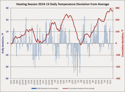
A few weeks ago, we shared the data that indicated our winter temperatures were about as close to average as possible this year. As we look at the entire heating season, the data looks a bit different. If these charts look unfamiliar, see the footnote at the bottom of this post for an explanation of the data presented in the charts.
An interesting phenomenon to note is that in early March our heating season was close to the historical norm. Predominately warmer than normal temperatures since early March have produced our entire cumulative deviation from normal, indicating that the 78 final days of the season averaged over 4.6 degrees warmer than the historical norm.
Recently it occurred to me that all our readers may not have gleaned all the information these temperature charts can communicate, so I present the next chart as an educational tool.
I include the red cumulative deviation curve on these temperature charts for two main reasons: (1) the ability to determine how the data as a cumulative total compares to historical norms, and (2) to recognize trends in the temperature data that may not be easily apparent in the blue daily deviation bars. On this chart I've added red (warmer) and blue (colder) arrows to illustrate the trends indicated by the red curve (feel free to click the chart for an enlarged view). In case you hadn't noticed, when the red curve slopes up from left to right, that indicates that the daily deviations from normal have been predominately warmer than average. Likewise, when the curve slopes down from left to right, colder deviations have predominated. One can easily recognize at least seven extended temperature trends through the last heating season: four when warmer temperatures prevailed, and three when the daily averages below normal outweighed those above normal.
Since temperatures that were near normal would present a red curve that was roughly flat from left to right, I found it interesting that we seldom observe that characteristic in our temperature data. Instead, it seems our temperatures are either well above normal or well below normal, leaving very few "normal" days! This lead me to conjecture that a histogram of the daily temperature deviations for an entire year might look different than the normal distribution, or "bell curve" that one might expect.
To my surprise, the histogram showed our weather to be a lot more "normal" than I expected. A histogram is a chart in which each bar represents the number of times (or frequency) that a certain temperature deviation was attained. In the chart above, each bar actually represents a range of temperatures three degrees wide. For instance, the short bar at the far right indicates that there was one day in which the deviation from average was greater than 21 degrees, but less than or equal to 24 degrees. The next bar to the left shows five days in which the deviation from average was greater than 18 degrees, but less than or equal to 21 degrees, and so on. As expected, there aren't many instances at the extreme temperature deviations represented, but there are quite a few days in which the average temperature was very close to the historical average.
The most populated group is that in which the average temperature was the same as the historical average or one or two degrees colder. The number of days in 2014 when the mean temperature was within 5 degrees colder to 6 degrees warmer than the historical average was 182, just shy of half of the days of the year. Since 2014 ended a little colder than normal, it might be surprising that 168 days were colder than the historical average, while 179 were warmer, and 18 days matched the historical mean.


No comments:
Post a Comment